Why Use a Red or Orange Underpainting Before Starting an Artwork?
Share
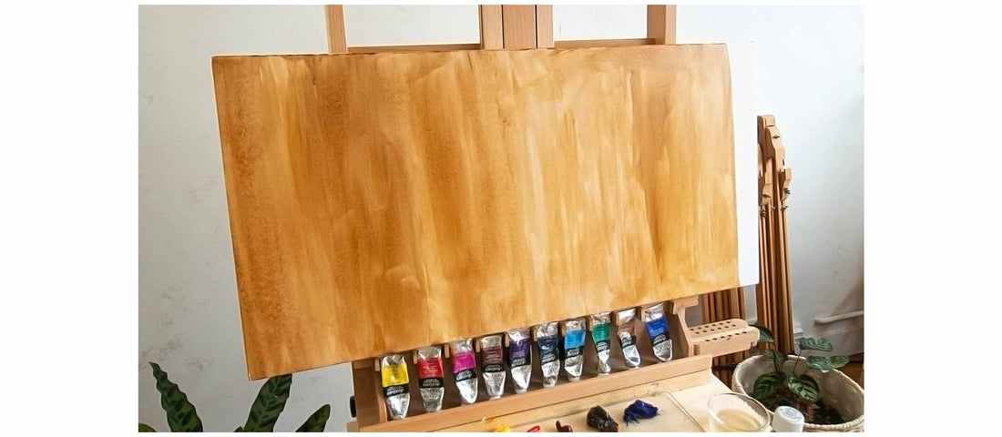
As an artist, one question I get asked frequently is why I begin my paintings with a red or orange background. Let me share why this technique is not only visually striking but also a powerful tool for creating dynamic and cohesive art.
The Benefits of Using a Red or Orange Background
-
Adds Vibrancy and Unity to the Painting
Starting with a red or orange background brings energy to the artwork, especially in areas where the base color remains visible. Even when mostly covered, it subtly influences the colors layered on top, helping to unify the whole composition and make everything feel more connected.
-
Improves Judgment of Light and Shadow
Working directly on a white canvas can distort the way we perceive values: everything appears darker in contrast to pure white. Using a colored ground creates a more neutral base that helps you judge light, mid-tones, and darks more accurately.
-
Enhances Color Contrast
A warm background interacts beautifully with cooler colors like blues and greens, making them appear more vivid and dynamic. The contrast creates a visual tension that draws the viewer’s eye across the canvas.
-
Speeds Up the Painting Process
Covering the stark white of the canvas with a bold color eliminates the distraction of empty space. This allows you to focus on building the composition without worrying about filling every corner. It also serves as a useful guide for judging the balance of colors and values.
-
Adds Energy to the Artwork
Even when mostly covered, the warm undertone of red or orange influences the overall mood of the painting. It can inject a sense of energy and emotion that subtly enhances the viewer’s experience.
Choose Your Background Color Intentionally
While I personally gravitate toward red or orange, you’re not limited to these shades. One particularly effective approach is to choose a complementary color to the dominant hues you plan to use in your piece. For example:
If your painting will feature mostly green, a red underpainting can create a rich and balanced harmony.
Planning to use a lot of blue? Consider an orange base to add warmth and vibrance through contrast.
For yellow-dominant works, a purple background can offer depth and drama.
Choosing the right background color based on color theory helps the final composition feel more cohesive and visually engaging, thanks to the natural balance between complementary hues.
Why I Love This Technique
Using a red or orange base has become an integral part of my creative process. It allows me to work with confidence, knowing that the energy of the underpainting will influence the final look of the painting in a compelling way.
Try It for Yourself
If you’re an artist looking to experiment with your process, I highly recommend starting your next painting with a colored background. Whether it’s red, orange, or another complementary tone, this technique can elevate your work and open up new creative possibilities.